Brok Bouwmaterialen
01/2025
UX
UI
Brok Bouwmaterialen arrow_outward is a Dutch hardware store that operates entirely online, serving both private customers and B2B clients. Their product catalog includes everything from decorative tiles to insulation materials, wood, and general construction supplies. Brok had recently undergone a visual redesign with another designer, but they encountered serious UX and functionality issues, particularly on their product pages, which are critical to both user experience and conversions. They approached me to restructure and redesign these pages, while also expanding the design system with essential missing components, such as a mega menu and system notifications.
Product pages
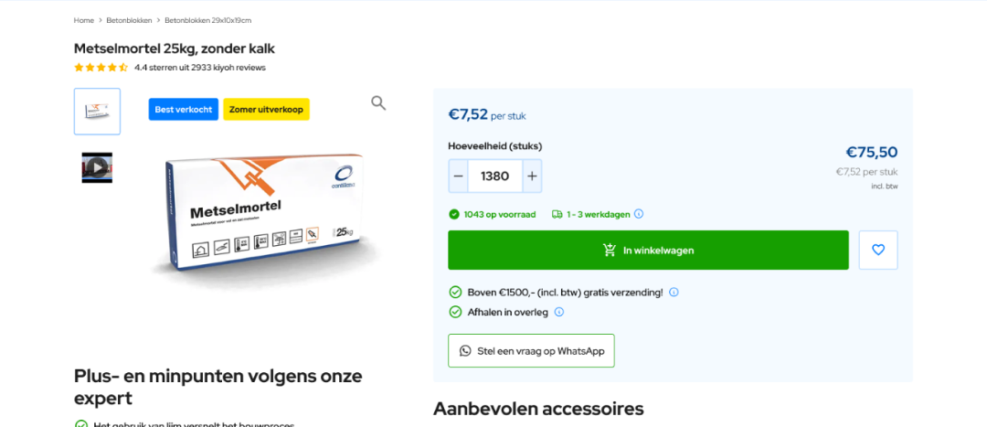
A central focus of the project was the product detail page. Because Brok sells so many different types of products each with its own units of measurement, configuration options, and purchase logic, a single product page template wasn’t going to cut it.
Instead, I designed a series of adaptable product page layouts, each tailored to a specific type of product and interaction.
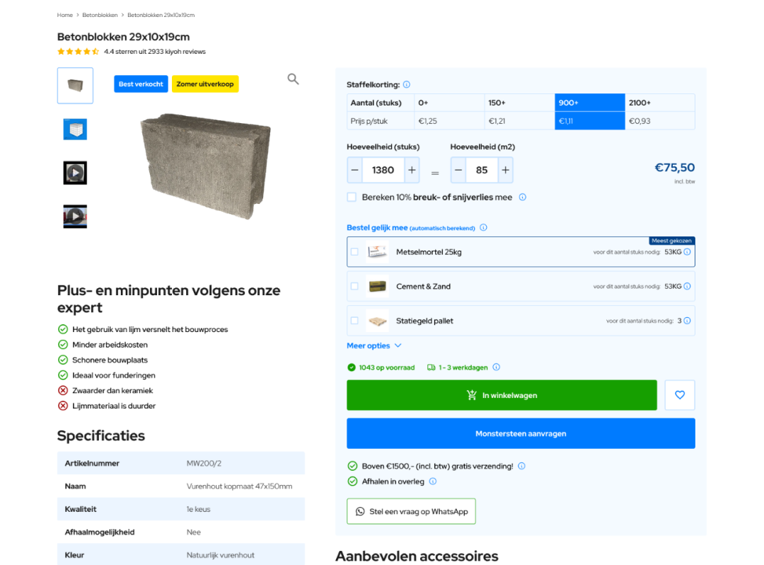
For example, products like concrete blocks are sold in square meters. The user needs to know how many blocks they need for their area, and how that translates into actual purchase units. I created a layout that combines a volume discount table (to encourage bulk purchases) with a tile calculator that automatically converts surface area into quantity, reducing the chance of ordering mistakes.
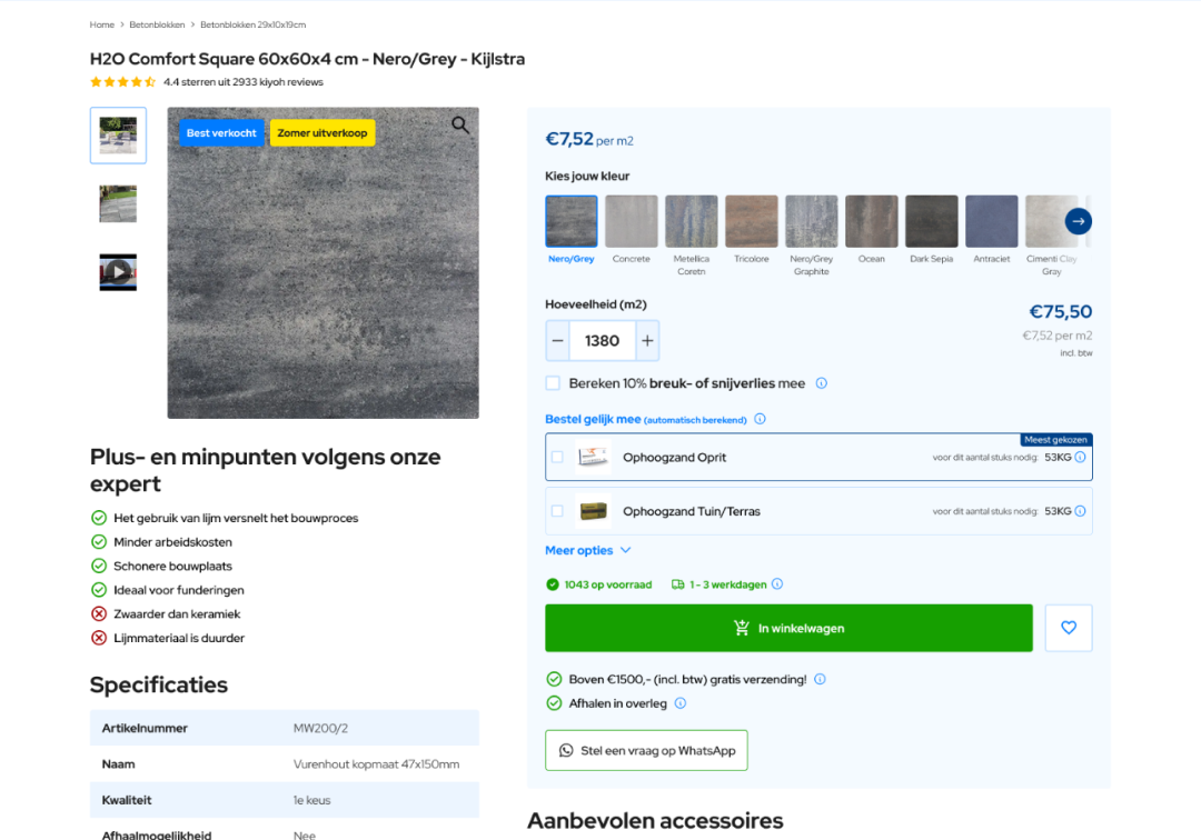
In contrast, for decorative products like tiles with different finishes or patterns, the layout needed to focus more on variant selection. These users aren’t calculating materials, they’re choosing the exact look and finish they want. Here, I designed a more visual layout with thumbnail selectors and variant details, making it easier to compare styles at a glance.
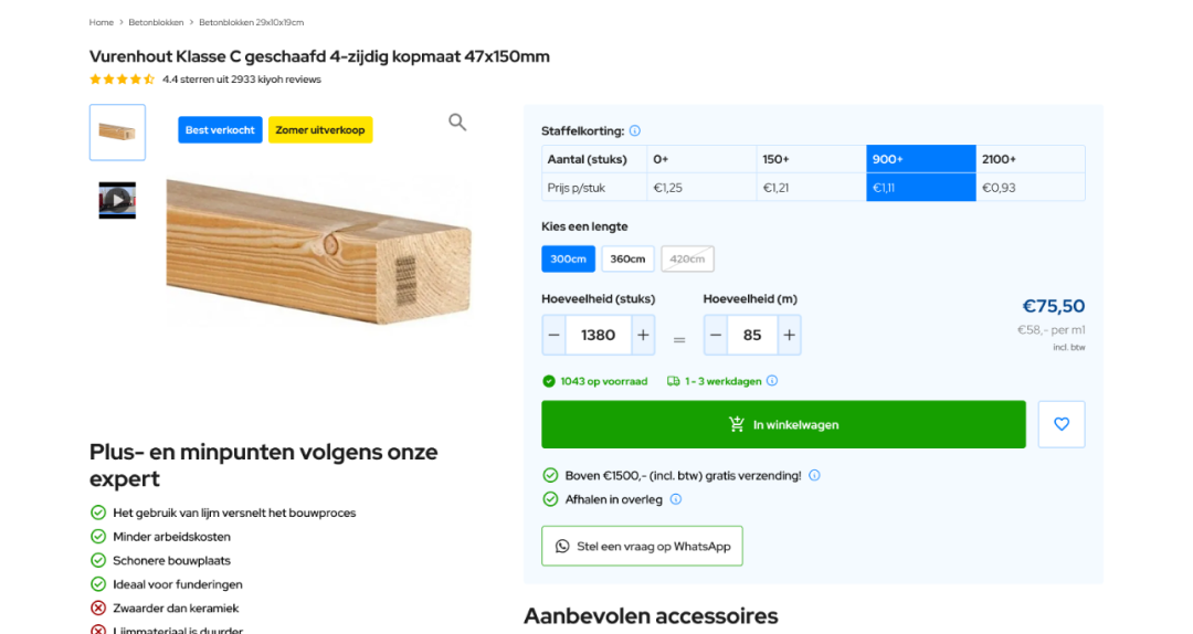
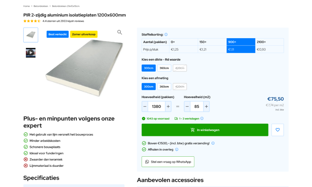
Other materials, like timber or insulation, required a configuration model based on dimensions. Some products only needed a simple length selector, while others involved two or more inputs (for example, selecting both the thickness and width of insulation panels). I created flexible UI components that allow the same layout to adapt depending on whether it needs one or multiple selectors.
Lastly, for the more straightforward products like screws, adhesives and tools I designed a simple layout that kept things clean and to the point, with a focus on price, availability, and quick add-to-cart functionality. All of these layouts shared a common design language but were customized to suit their specific use case.
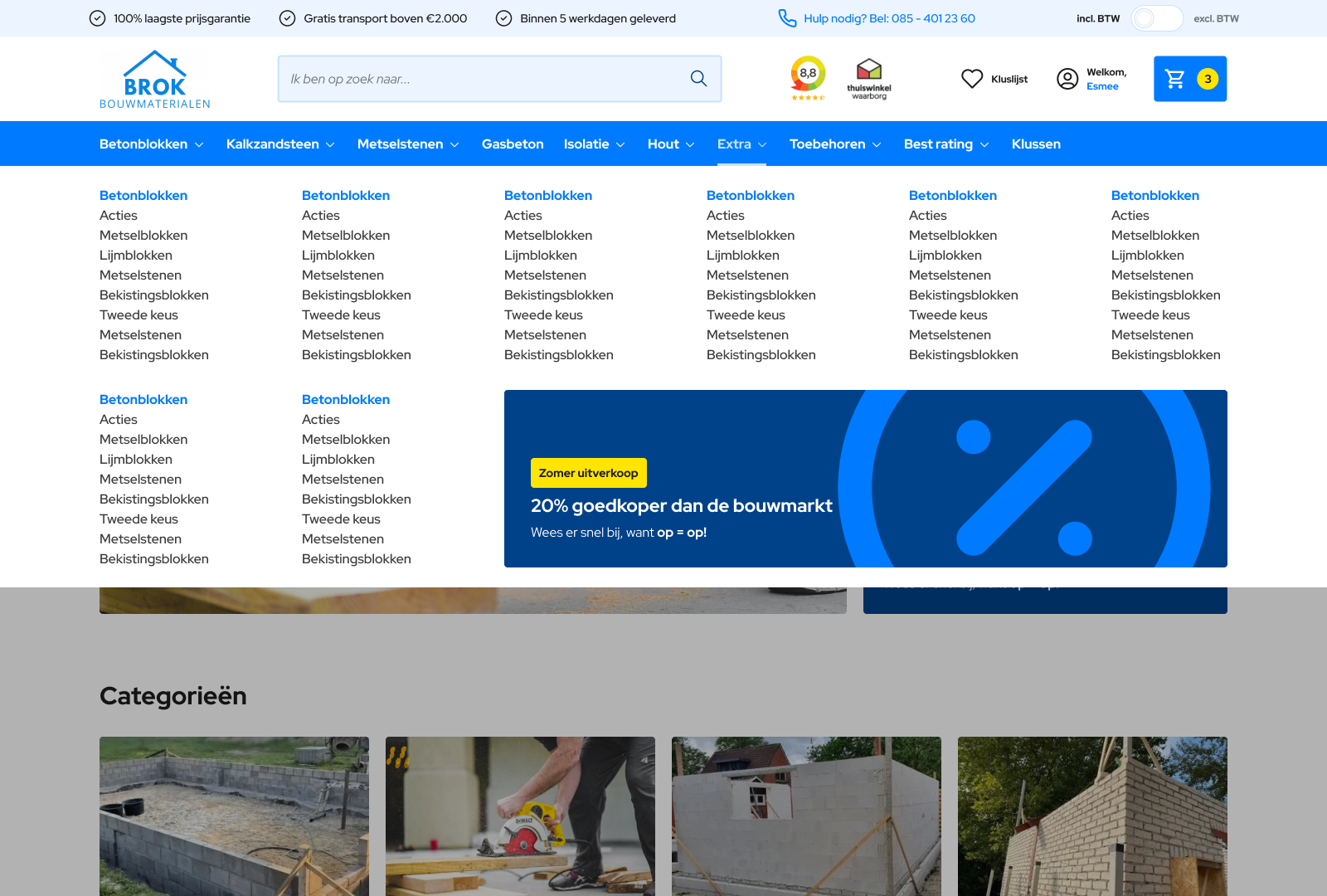
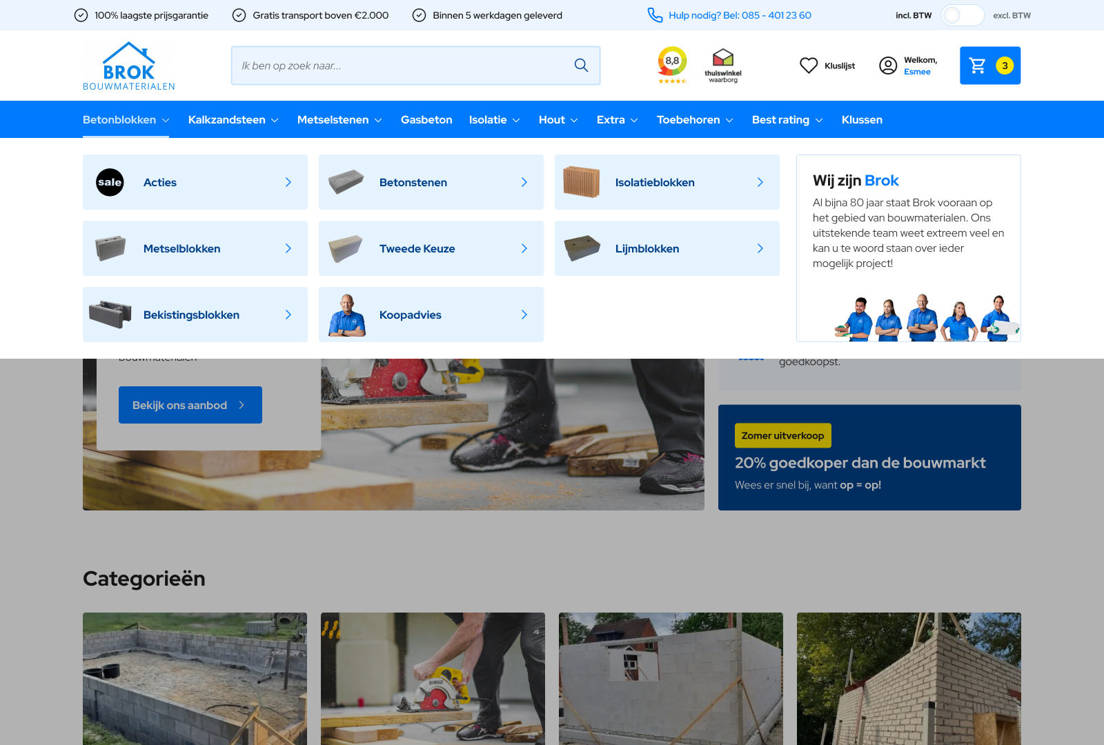
Mega menu
Another key challenge was the site’s navigation. The new visual design had done away with a proper mega menu, but Brok’s catalog was far too complex to be managed by a basic dropdown.
We revisited the category structure and reworked it to better suit the mega menu format. Some menus initially had too few or too many subcategories, which made it difficult to create a layout that would both work technically and make sense visually. I helped reorganize this structure, grouping items in a way that felt intuitive to users without overwhelming them.
System notifications
A surprisingly overlooked part of the original redesign was the absence of system notifications. These are critical for any platform as they guide users through actions like adding items to the cart, encountering errors, or receiving confirmation after an order.
I designed a set of system notifications that seamlessly integrated with the existing style but stood out enough to capture attention when needed. These included success messages (e.g., "Product added to cart"), warnings (e.g., low stock alerts), errors (e.g., form submission issues), and informational messages (e.g., promotions or shipping delays).


Each message was designed with clarity and accessibility in mind, using consistent iconography, clear contrast, and predictable placement to avoid disrupting the flow of the shopping experience.
Reflection
What made this project especially interesting from a UX perspective was the sheer variety of product behaviors that needed to be accounted for different measurement systems, configurators, variants, and discount logic. The challenge was to bring all of that complexity under a unified system, without confusing the user or overcomplicating the interface.