Pluimen
05/2023
UX
Research
Pluimen was a coupon based gift shop, that wants to have a customer branded ‘premium’ shop. This is because of some legislation that makes having a closed off company branded environment interesting for certain customers. It was up to us to figure out a way to stay true to Pluimen, but also brand the store towards customers’ own branding (think IKEA, Deloitte etc.) within the technical constraints of the backend.
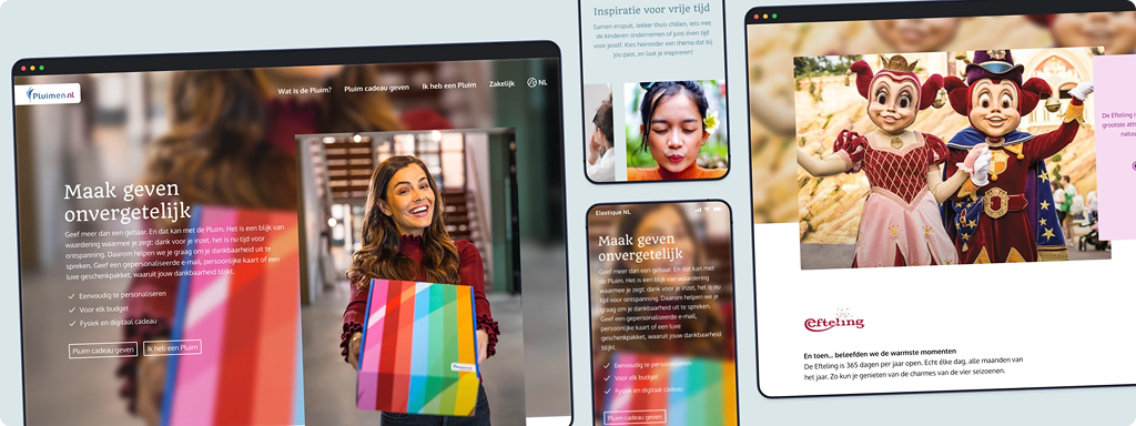
What is a Pluim?
The Pluim (roughly translates to praise or compliment) is a gift card that is usually given in a Christmas care-package, a dutch custom where employers give their employees a box of usually luxury goodies such as wine, smoked salmon and chocolates as a Christmas present.
The Experience
Pluimen wants you to think of their card as an experience. Most of the things you can buy on their sites are also in this spirit. Most of their product range consists of hotel stays, activities and diy products. As such they dislike displaying prices and want their premium environment to work with a point system.
The Design Challenge
How do I create a Christmas themed, customer branded premium environment for companies, while staying true to the Pluimen experience, within hard technical constraints that inhibit the editing of certain aspects of the site?
What can we do?
While brainstorming we came to the conclusion we could basically only do this through setting ‘themes’ that would shift the colours of the site towards a ‘premium neutral’ with whites, grays, and blacks, and then brand certain aspects like content fields and buttons in the colours of the premium customer. Changing the serif and script typefaces wasn’t possible because of the backend, so color themes is basically the only thing we could do.
Theming
As discussed earlier, one of the wishes was for a Christmassy theme to the store. The people who would gift a Pluim could do so with a custom message, images and video's. When folks would add their code to their account for the first time they would be met with an unwrapping animation, either in regular Christmas colors (Santa red and spruce green), or in the colors provided by the custom theme.
.png)
.png)
The other addition to make it feel Christmas/winter themed was the addition of snowflakes fluttering from the header. This was something I personally wasn't a big fan of, but we felt it didn't impact the user experience enough for us to veto the idea.
These themed experiences were also different from the main store in the way that they used a form of store credit rather than money. This credit was expressed in Pluimen coins, customers could see the amount they had in the header, and all the prices were shown in the credit instead of regular currency.
.png)
My recommendations moving forwards
Making the neutral premium shop improved the site already, increasing clarity and readability of a lot of components while reducing visual clutter, mainly in the footer.
My main recommendation would be to move away form their current backend towards one that supports more in depth editing and allows them to be more creative and expressive in their pages. The other one would be to abolish the point system they use instead of actual currency. This is more of a user centric point of view, but distinguishing between products and their value becomes increasingly more difficult as we try to hide what you're actually paying for a product. People can probably still find out if they search hard enough, but that may also let them find discrepancies in the pricing.
Update (2025)
Pluimen has recently declared bankruptcy and have since also taken down their website.
Update (2026)
It seems that Pluimens site is back up in the air.