Sliponline
08/2024
Ideation
UX
UI
A lot of our customers at Shopmonkey take on a ‘Grow membership’ which means that over time we will slowly continue developing their websites. These are some of the items I’ve designed for Sliponline arrow_outward during that time.
Accessibility
One of the first things we changed was increasing font sizes to improve legibility of both the body texts and price tags.
Logo & colors
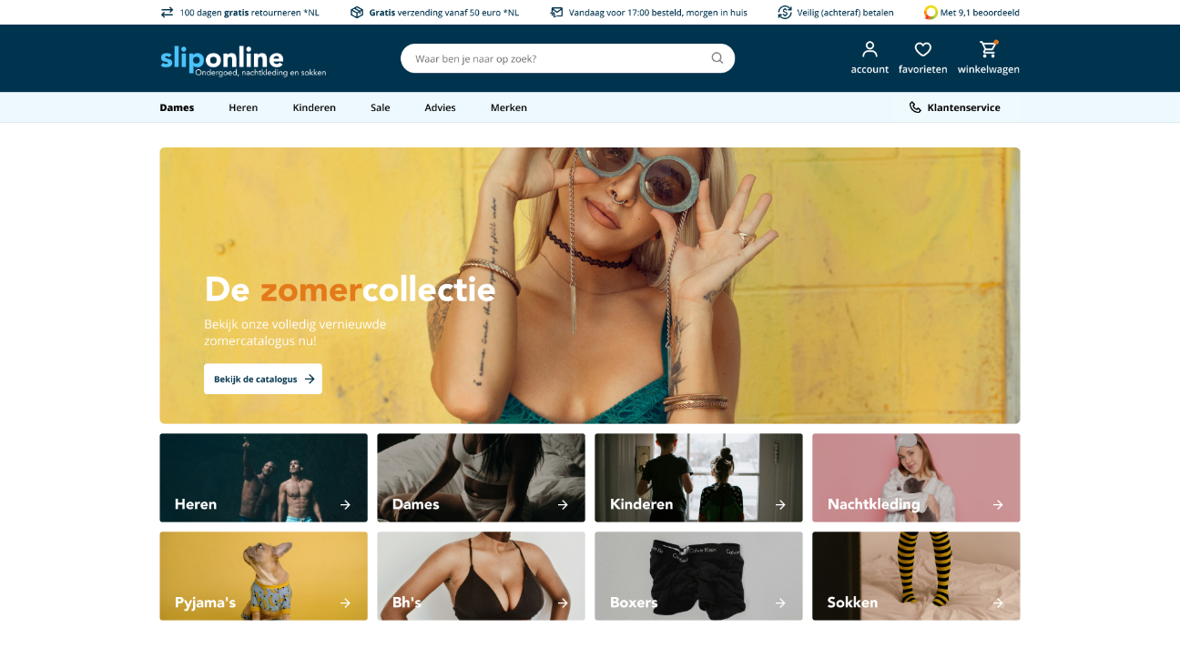
Sliponline used to feature a striking cyan color on white backgrounds, which was quite busy to look at, and didn't meet contrast standards. The combination is bright together, so bright it stuggles with contrast between the two, so we dialled the cyan back to a navy color and we brought the contrasting orange they sparsely used to the foreground more. While we did this we also redid their logo to be more modern.
Home page
We streamlined the new homepage with a new hero and matching category cards. We tried to stay close to their original look as to avoid confusion for recurring customers.
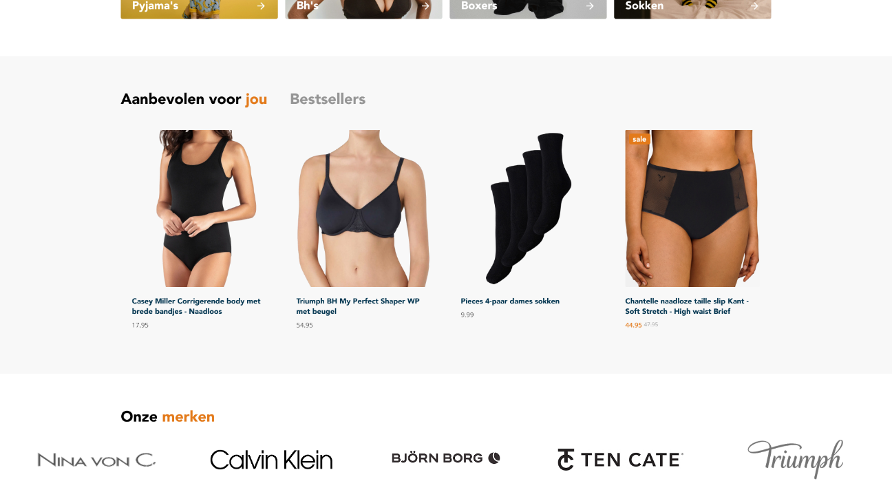
Recommended products
Reduced visual noise to focus on the product, increased font sizes for better readability.
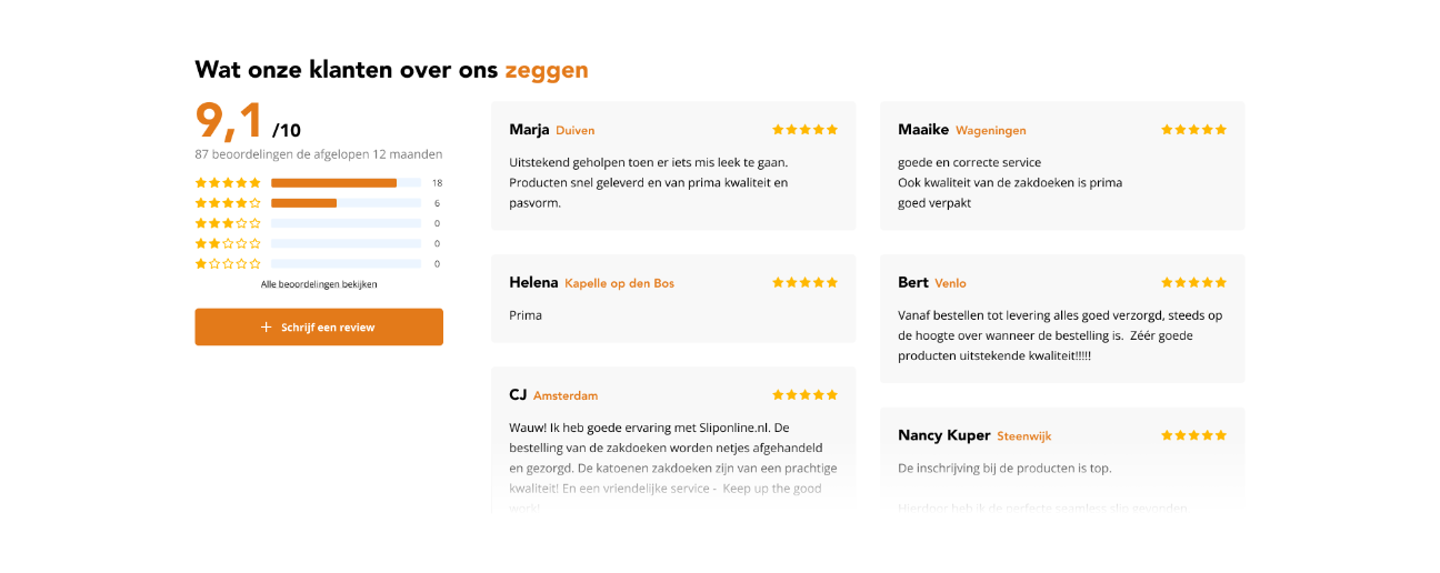
Reviews
The new review section improves the legibility of Sliponline's score breakdown and shows more of the recent reviews at a glance.