Vloerglijders
03/2025
UI
Vloerglijders arrow_outward Vloerglijders is a Dutch company that offers smart and simple solutions to a common household problem: floor damage caused by sliding furniture. Their range of floor protectors ensures your floors stay beautiful, scratch-free, and quiet whether it’s under a dining chair, sofa, or bar stool.
Wishes
Vloerglijders approached us for a full visual refresh of their aging website. While they didn’t have a strict wishlist, they did share several brands they admired for their design and user experience:
- Cloudpillo arrow_outward - A sleek Dutch pillow brand with modern, Instagram-friendly aesthetics.
- Upfront arrow_outward - A minimal, health-focused supplement brand with clean UI and product focus.
- Booking.com arrow_outward - A corporate yet effective layout with strong usability and clear structure.
The challenge was to explore a modern, engaging design direction that elevated the brand’s visual presence, while remaining accessible and conversion-focused.
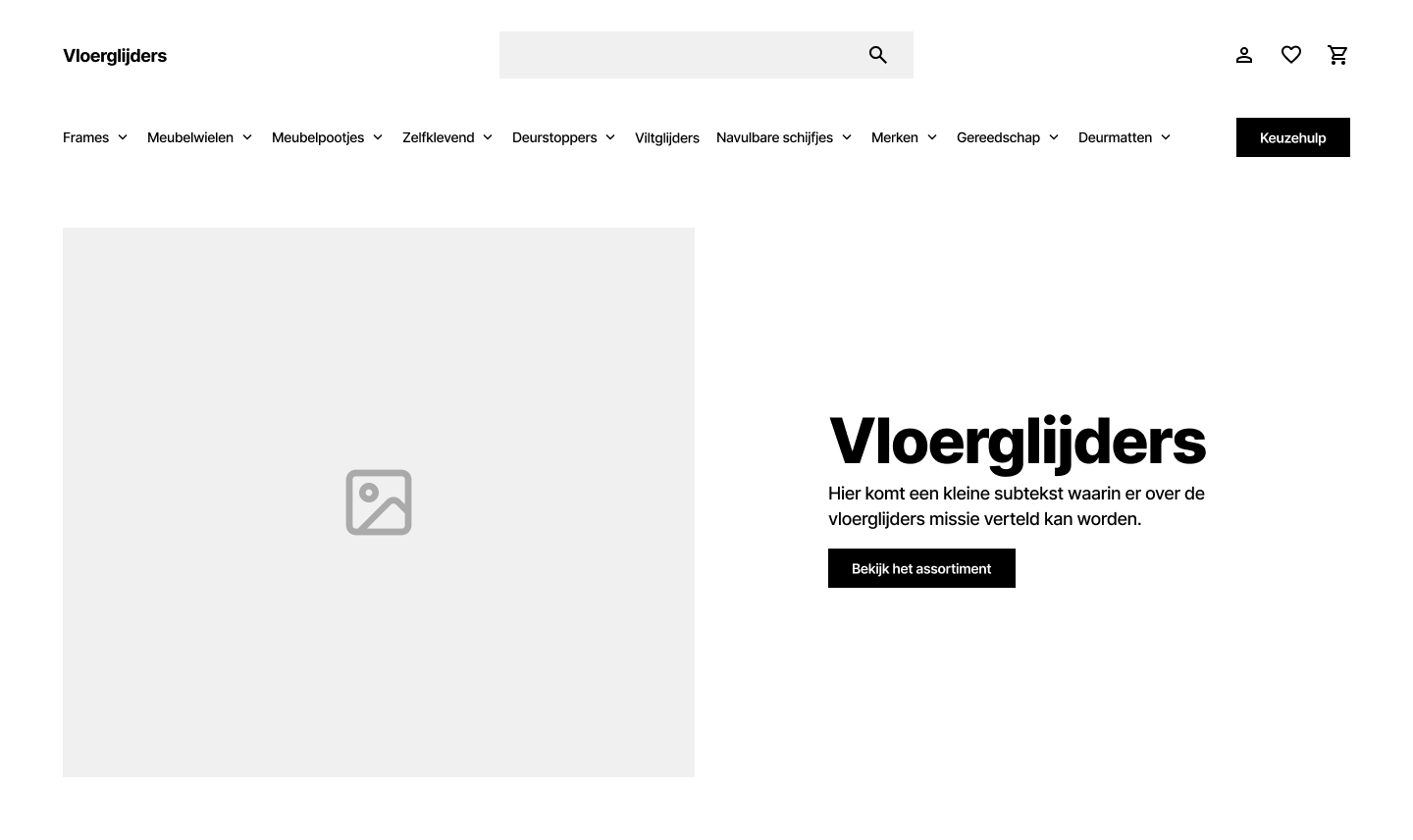
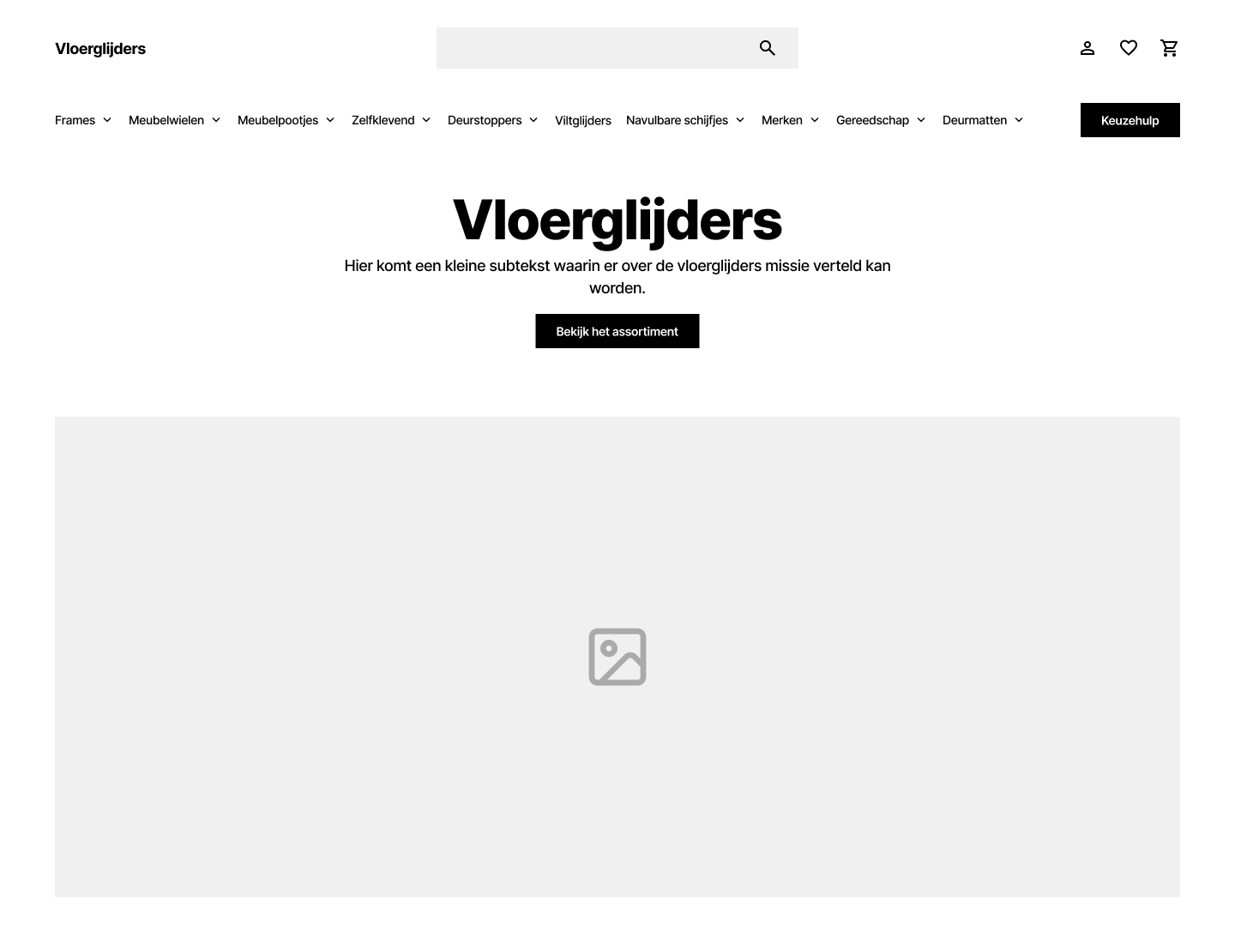
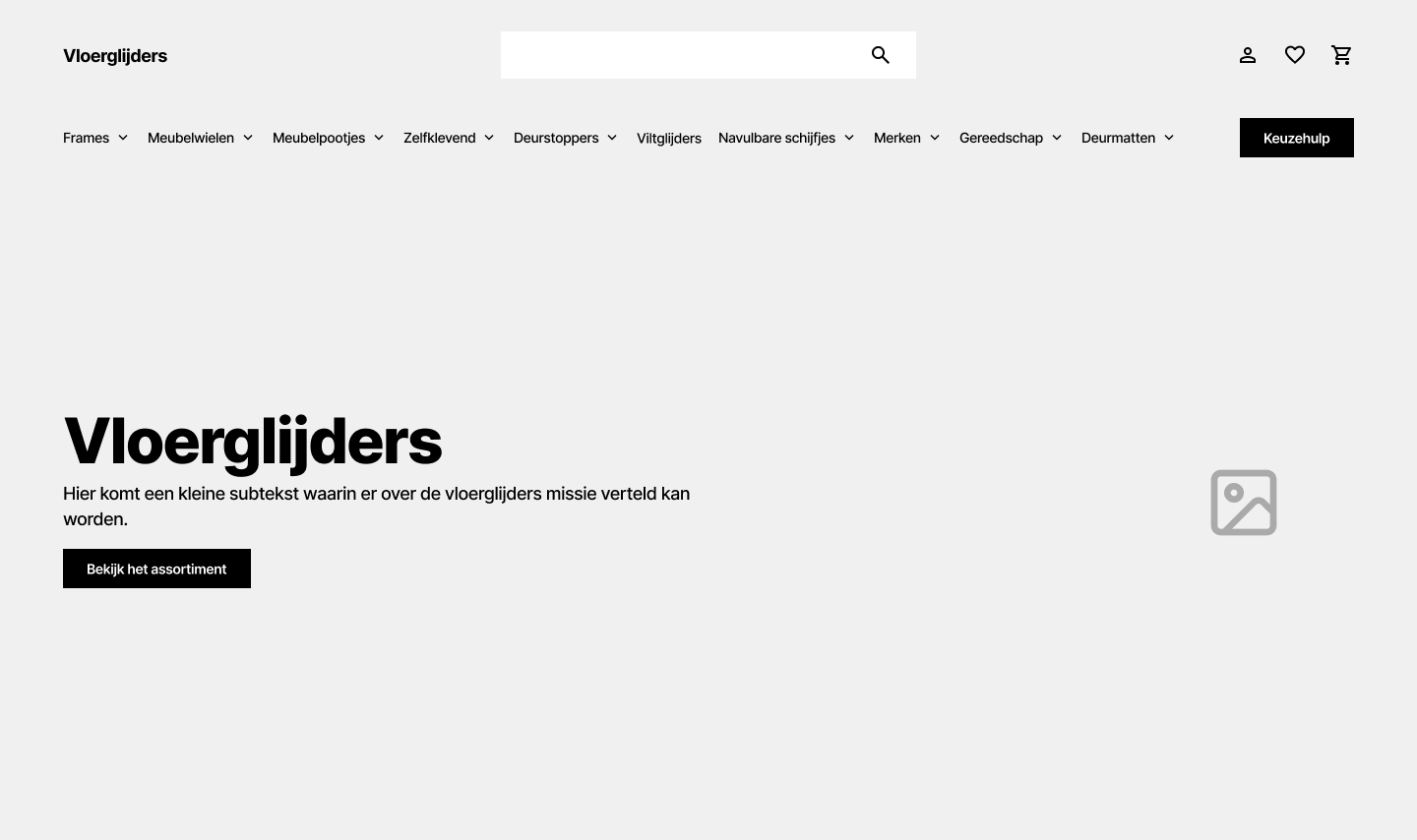
Wireframes & Early Exploration
The first step was developing a series of wireframes to explore layout, content hierarchy, and structural possibilities based on the provided references. I focused on creating multiple visual directions that felt unique yet aligned with the brand’s identity.
Visual Direction
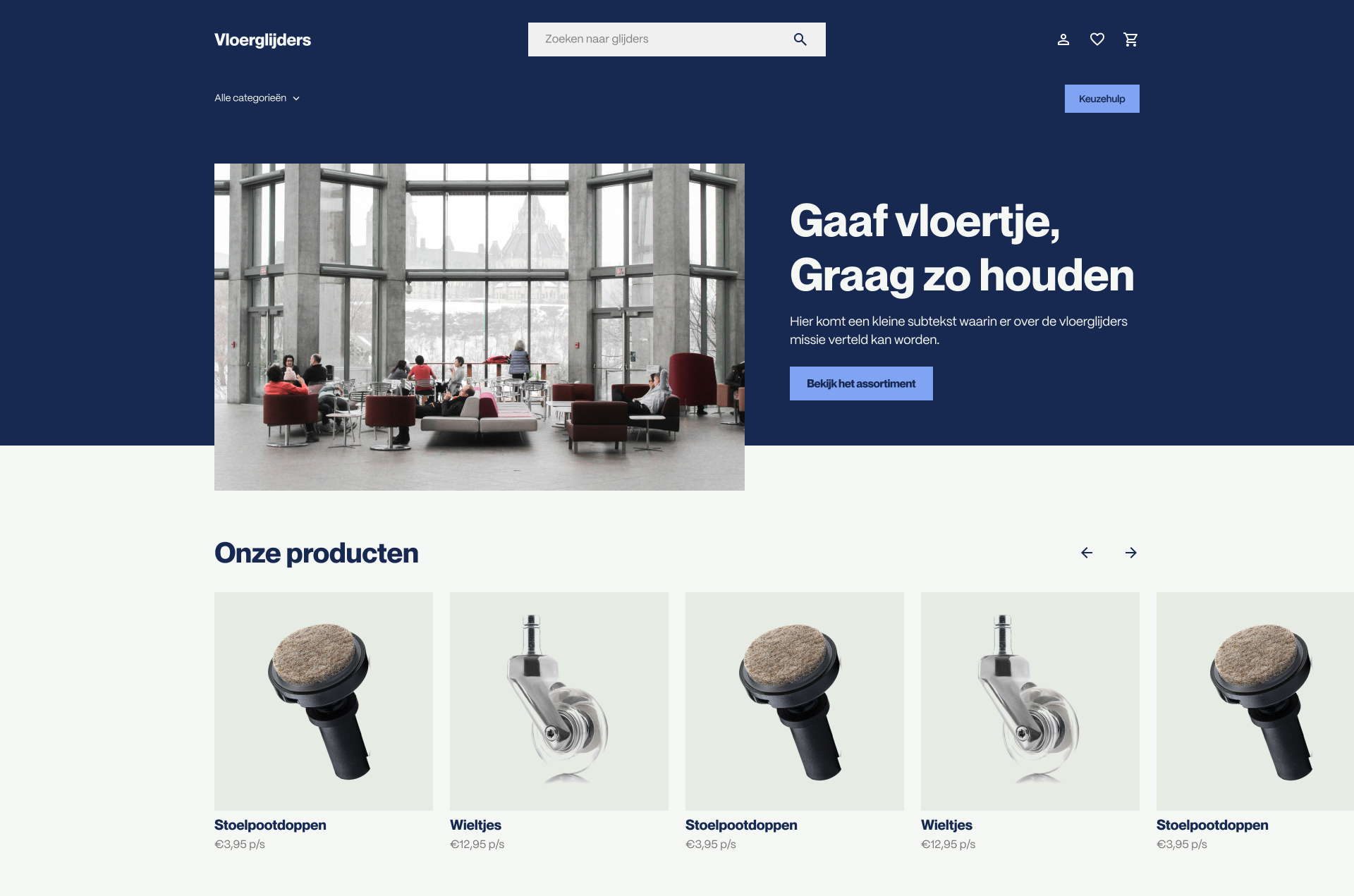
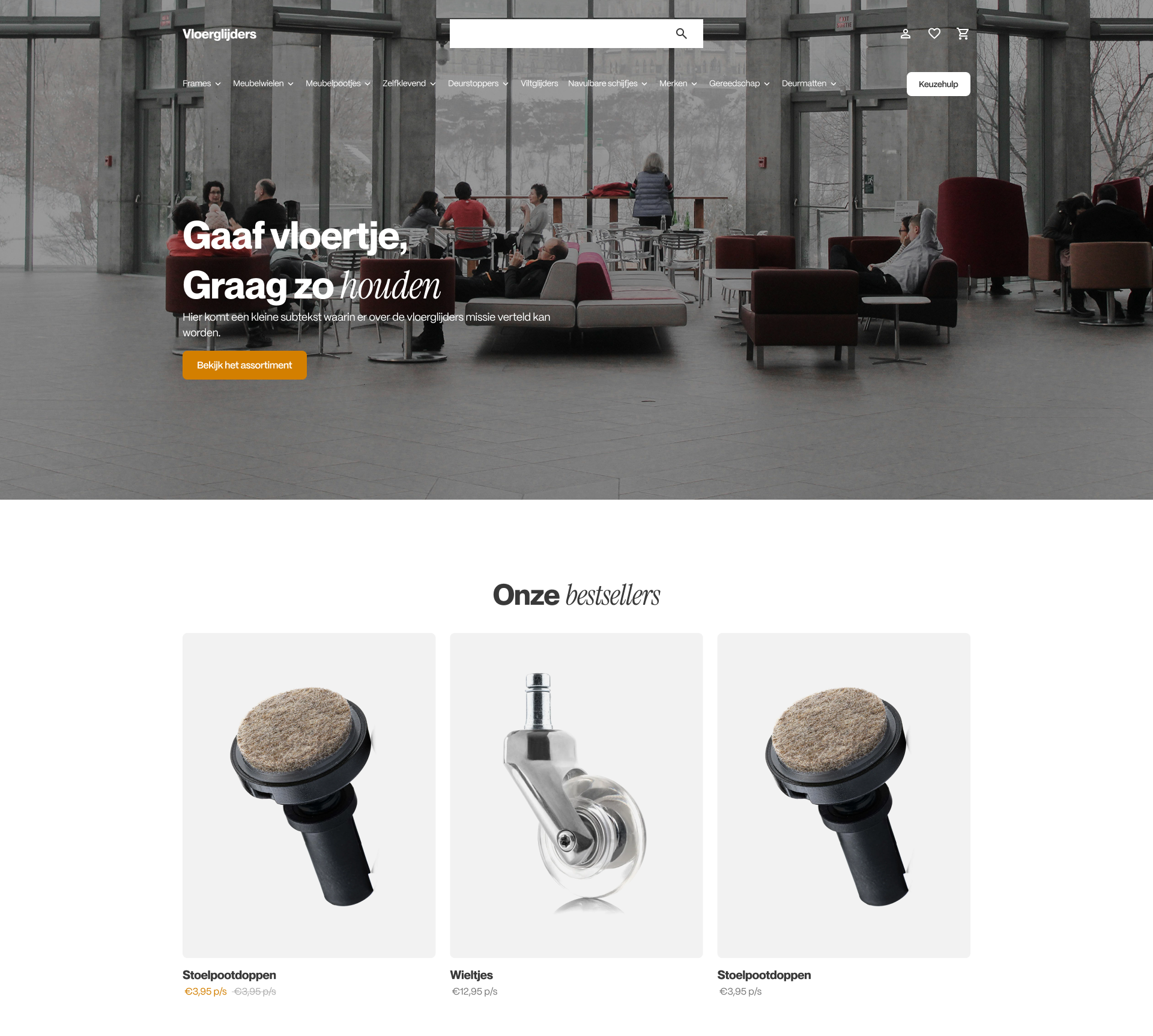
Taking cues from the brands Vloerglijders admired, I explored a modern, youthful aesthetic that blends lifestyle imagery with clear product communication. To give the brand a more contemporary feel, I leaned into an "Instagram meets interior design" look using curated, candid photography mixed with stock where needed, given the conceptual nature of the work.
Something I did in all the design to make the product images stand out more is cut away the background so the product photography could be more part fo the design. This lets you customize the product card more, in this case I decided to still use a blocked out background, but in theory the images could be completely standalone.
Conceptual Redesigns
Each concept draws inspiration from one of the referenced brands, interpreted through the lens of Vloerglijders’ identity and market positioning.
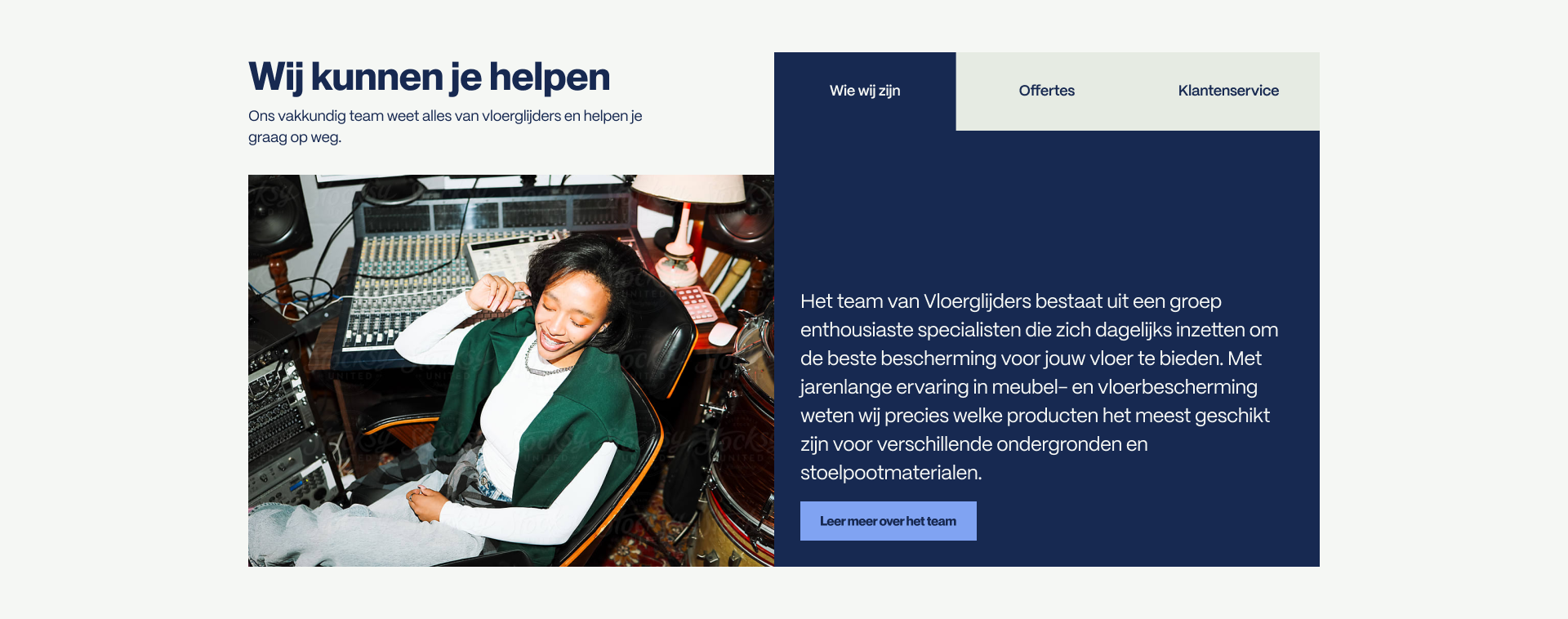
Concept 1: Inspired by Booking.com
This direction embraces a more structured, corporate feel — clean lines and minimal rounded edges. I used color blocking and imagery to create visual rhythm and hierarchy.
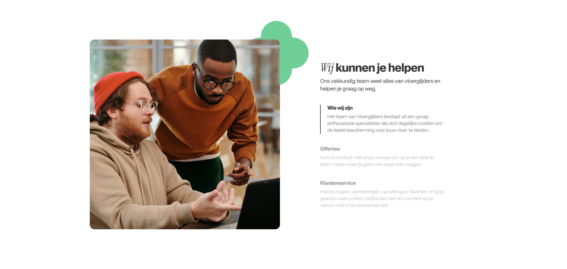
Concept 2: Inspired by Cloudpillo
A minimalist, design-forward approach. Here, visuals do most of the storytelling: large product photos, soft shapes, and a balanced white-space-driven layout. Typography is key in this concept, mixing sans-serif with cursive serif styles for a playful, modern touch.
Subtle design flourishes like floating elements and organic shapes give it a youthful, vibrant personality.
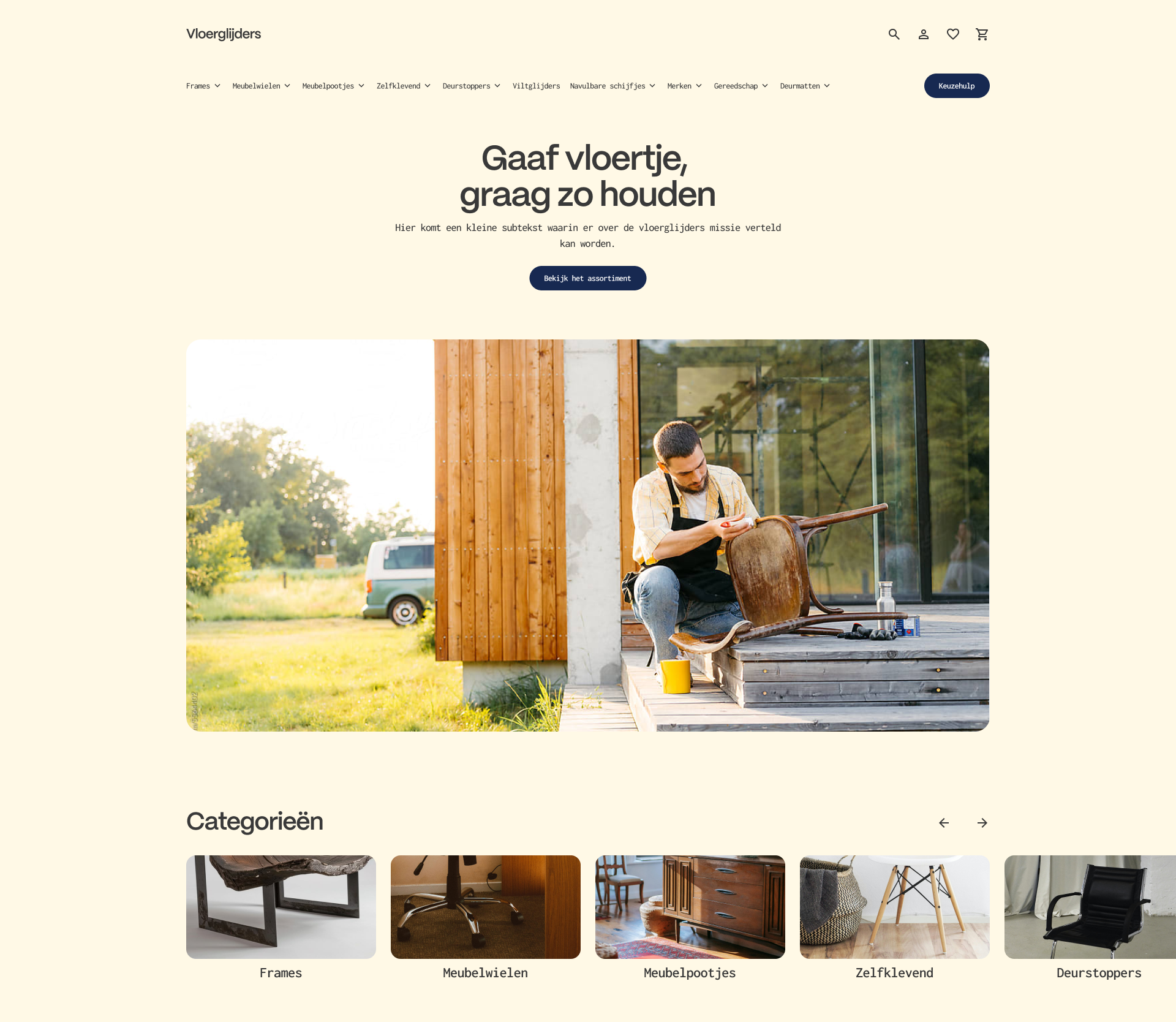
Concept 3: Inspired by Upfront
This is the most minimal and "indie" direction content is more spaced out, with clear separation between image and text blocks. The result is a calm, confident design that puts clarity first while retaining character.
Next Steps
These three concepts were presented as part of the exploration phase. The goal was to identify visual and structural preferences that Vloerglijders could use as a foundation for a full redesign. The next step would involve refining the chosen direction, applying it across key pages, and further aligning it with user needs and business goals.